-p-500.png)
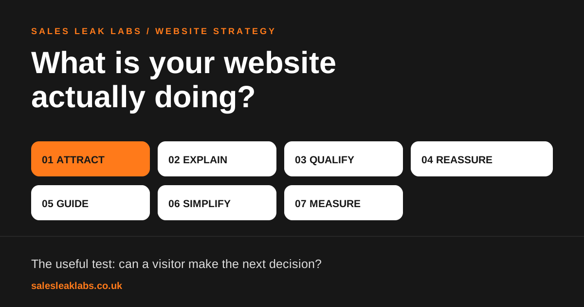
A good business website does more than look credible. It should attract relevant visitors, explain the offer, answer buying questions, build trust, make the next action obvious, make that action easy and show you what happened afterwards.
That is a more useful definition than “modern design”. An attractive site can still make someone hunt for delivery information or guess what happens after pressing “Contact”. Equally, a modest site can do a remarkably good job of helping a customer choose.
1. Attract the right visitors
Search, referrals, social, email and paid campaigns can all bring visitors in. The useful question is whether the page they land on matches what they came to do. Someone searching for emergency drain help needs a very different first screen from someone comparing bespoke kitchens.
Start with your real customer questions. Give important services and product categories their own useful pages. Make them easy to find from navigation and link to them from relevant guides. More visits alone are not the outcome; relevant visits that become useful enquiries or orders are.
2. Explain what you do within a few seconds
Imagine hiding your logo and asking a stranger to look at the homepage. Could they say what you sell, who it is for and where you operate? “Innovative solutions tailored to your needs” answers none of those questions. “Made-to-measure wardrobes designed and fitted across West Yorkshire” does.
Try a 10-second test with someone outside the business. Show the first screen, then ask: What is this company offering? Is it relevant to you? What would you click next? If they cannot answer, rewrite the first screen before buying more traffic.
3. Help people decide whether you are right for them
A service page should answer the questions a good salesperson hears every week: what is included, who is it suitable for, what area do you cover, what does the process look like, how long might it take and what does it cost or depend on? A product page needs dimensions, variants, delivery and returns where relevant.
Some visitors are ready to enquire. Others need proof, pricing context or examples first. Give them a route to the information instead of treating every click short of a form submission as failure. If you are planning a rebuild, our UK website cost guide explains how scope affects the quote.
4. Give them a reason to trust you
Show the evidence beside the claim it supports. A project photo near a bespoke fitting service, a specific testimonial near a consultation offer and clear delivery terms near a purchase action are more useful than a generic row of logos in the footer. Show who is behind the company and how to reach them.
Trust is also about keeping information current. A stale opening-hours notice or an offer whose terms cannot be found creates unnecessary doubt, even if the service itself is excellent.
5. Make the next step specific to the visitor
There is no button phrase that wins for every business. The best action describes the outcome and matches the visitor’s intent. “Contact us” may be a useful navigation label, but often says too little as the main instruction on a service page.
For Sales Leak Labs, the relevant action from a diagnostic article is Get a free website review. It leads to a personal 10–15 minute video with three priorities, rather than an unexplained sales call. Specificity makes a promise; the destination must keep it. Nielsen Norman Group’s research on generic “Get Started” links illustrates why a button can attract clicks yet frustrate the person who clicks it.
6. Make the action easy to complete
If a prospective customer wants a quote, ask for enough detail to respond usefully and leave the rest for the conversation. Tell them when to expect a reply. On mobile, test the whole route with a thumb: open the menu, find a service, tap the phone number or complete the form. On an online store, test a real product choice through basket and checkout without placing an order.
A simple form with a clear outcome can outperform a beautiful page that ends in a confusing or broken handoff. That is a hypothesis to test against your own enquiries, not a universal conversion-rate promise.
7. Tell you what worked
Measure actions that matter: qualified forms, calls where trackable, bookings and orders. Compare them with relevant landing pages and traffic sources. Keep lead quality in the loop: ten unsuitable enquiries are not necessarily better than three good ones. Check that forms actually arrive, that confirmation messages work and that a payment success is recorded once.
Visible friction is a credible potential conversion leak. Traffic, conversion events and customer feedback help establish how much it matters. Our review of 20 West Yorkshire business homepages shows what you can learn from the public journey and where that evidence stops.
Give your website a 15-minute job review
- Open your most visited landing page on a phone, without logging in.
- Write down what a new customer can understand before scrolling.
- Choose one task they came to do and time the route to completion.
- Check whether proof and practical details appear before commitment.
- Read the primary button aloud. Does it say what happens next?
- Submit a test enquiry and check the reply path.
- Compare that journey with actual qualified leads or orders.
If a page fails one of these tests, it does not automatically require a new website. Fix the most consequential point first, then check whether the result improves. If you want a second pair of eyes, send us your URL for a free video review. We will identify three practical priorities you can act on yourself or discuss with us.